Each industry is linked to specific trends. This is especially true of graphic design, marketing and, of course, web design. From the very beginning of the “technological revolution” you can track a lot of changes in the development of websites.
Innovations expand opportunities. That is why they influence which sites we want to see. This is how new trends are formed.
You can create quite unique pages. But if at least a little does not follow the trend, a person is recognized unfashionable, and the site is uninteresting. Analyzing the ratings of Awwwards – the community that determines the best sites of the day, month and year according to different criteria, I was able to highlight the upcoming trends in web design.
ADAPTIVE DESIGN
First of all, I want to highlight the trend that will be on top for more than one year. The web page should be readable and visually appealing on any screen or part of it. That’s why adaptability is one of the key requirements of web design. First of all, the focus will be on mobile phones. Obviously, they are used for surfing the Internet no less than computers and laptops. Also consider the browser window mode, which is often used to simultaneously view multiple web pages.
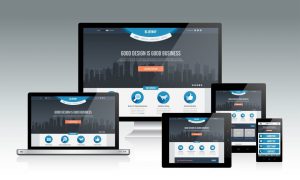
In addition to text and media content, any elements may disappear from the screen when you change its size. But some of them should take on a different look, becoming readily available. So, the key component of the web page on the phone is the “Menu” button, which will allow you to go to: personal account; shopping cart (if it is a store); pricing info; site settings (if they are provided for the user); help; main sections of the site. From personal experience, I can say that I leave 80% of non-adaptive sites instantly, since it is inconvenient to work with them. Exception is the availability of the necessary information to me. In this case, I have to adapt. But ahead is 2020. The task of developers is to save users from difficulties.
PUSH NOTIFICATIONS
A trend controversial enough for today, but I have to admit, it is gaining momentum. It is unpleasant to see a message from the site in the corner of the monitor while working or watching movies. However, often there is a benefit. For example, a notice that tickets to a concert of your favourite band or a football game are ending. Even though it’s a part of web development but also relates to UX design.
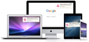
Notifications can be blocked, which will eliminate their annoyance. But on devices like a tablet or phone, they are often useful rather than unbearable. Most sites are already asking the user’s permission to send notifications. When adding this element, it is necessary to take into account the target audience and its needs. In the future, it is worth paying attention to the activity and core interests. It is important to properly configure the subject and frequency of notifications. This element should help users, not scare them.
MOTION DESIGN
The pace of the 21st century has made us very impatient. This also applies to find information on the Internet, even if there is enough time. Therefore, users are in a state of “instant exposure” if the required information is obtained in full on one web page.
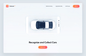
How to provide it? The implementation of “motion design”. One of the most trivial examples is adding GIF-animations to familiarise with the main characteristics of a car.
This way of presenting information is much more efficient than textual or even pictorial. The advantage of gif over video in faster loading, which is also very important when working with the site. GIFs can transfer the most complex ideas in a short amount of time. Moreover, they will definitely interest the user, which will make him stay on the site. One of the key benefits is that they work in any browser and smartphone, so they will be accessible to all. But also it is necessary to take into account that animations, as a rule, are short-lived. Consider that there is no more than 5 seconds. In this period it is necessary to enclose the entire message. If it doesn’t work, it’s better to replace it with a video.
VIDEO ADDING
Not a new trend, but for now there is no substitute for it. It creates a contradiction of lack of time when surfing the Internet. Most users have no desire to stay long on the site. But most of them are willing to spend 2, 5 or more minutes to view the relevant video.
Some statistics:
- 96% of users watch videos to explore the product in more detail;
- 79% said that it was the video that convinced them to buy the product;
- 68% prefer to study new projects by watching videos, rather than reading texts;
- 94% of PR managers said that video helps users to understand the idea of a project;
- 84% of managers are convinced that thanks to the video they managed to increase traffic on the site.
Information taken from the survey The State of Video Marketing 2019.
I can safely say that today video content is the undisputed leader among web trends. I do not know about any successful project, which representatives opposed the addition of video.
However, there is a short list of rules for adding this element to your site:
- Duration. No more than 5 minutes. The basis of the project can be easily described during this period. The task of the video – to attract the user’s attention and make him go deeper.
- Relevance. The video should clearly correspond to the page on which it is located. For example, you should not post the material “Our team” on the page “Why you need to work with us”.
- Simplicity. Send only the main message. If you move away from the topic, the user will be bored, but he will not understand the idea.
- Minimalism. The benefits of video does not mean that you need to fill a lot of clips. Some of the information must be submitted in text form.
CHAT BOTS
The next emerging trend is related to artificial intelligence. Users often turn to support with questions of all kinds. As a rule, over time they coincide and it is more and more difficult to respond to them psychologically.
Chat bots are programs designed to imitate a conversation, that currently are being developed and improved, becoming more like people. They collect a base of constant questions and in the future immediately respond to interested users.
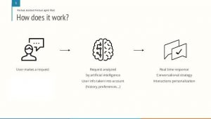
There are two types of bots: with fixed database and AI-based. The first option is something like an improved FAQ section and is ineffective. It is the second option that is a developing trend, since it greatly facilitates user acquaintance with the project.
The advantages of chat bots are that they are cheap (more expensive than the FAQ section, but much cheaper than the support staff) respond instantly and are available 24/7.
Disadvantages: do not understand sarcastic requests, cannot correctly answer the question asked for the first time. Experiments with chat bots began a few years ago. But for now they were remembered only as a stupid program, unable to respond normally to a banal query. Today they have “learned.” Now bots can complete an order, help with registration or restore an account.
WHITE SPACE
The use of “white” space is one of the principles of logod esign and an effective way to attract attention. Under the white space means the area between the design elements, as well as the space inside some elements of the web page (including line spacing and stretching of the font).
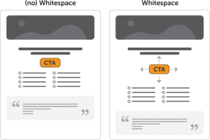
Proper use of white space. Source of the image There is an erroneous opinion in the network that all the white space is “empty”. As you can see, this is not quite the case. Between web design elements there should be an explicit indentation. It is also important to understand that, contrary to the original name “white space”, space should not be exactly white. It can be any color, texture or even a background image. The essence of white space is that it carries no semantic meaning. What you should definitely know when developing a web design – the types of white space: active and passive. The first type is specially created spaces between the elements of web design, which in a certain way lead the user through the page. The second is aimed at improving the aesthetic appearance of the page. This includes line spacing, indents between paragraphs, and other similar elements.
INTERACTIVITY
The development of technology has led to the fact that high-quality web design by default involves the creation of more complex and dynamic elements. Thus, today we can see a lot of integrated videos, micro-interactions, animated scrolling and much more. I will not be able to convey the whole essence of interactivity in one illustration, so I suggest you familiarize yourself with Garbage31. This site from the Ukrainian team really brought the concept of “user interaction” to a new level.
MINIMALISM
This trend is very often combined with white space. However, minimalism is a broader concept. It involves simplifying the interface in several ways: hidden navigation bar; minimum of colors; lack of additional details of graphic design (shadows, font variety); minimum of buttons; other.
I want to analyze this trend with specific examples. Both sites are designed in a minimalist style. Minimum colors, buttons, hidden navigation bars. However, the second option is significantly inferior in this regard for the following reasons: multiple fonts; use of shades; adding of geometry. Today, minimalism is moving towards maximum simplification with the display of as few elements as possible on one page. A good example of using minimalism is Apple site.
COMING – OUTGOING TRENDS
Finally, I want to highlight several trends that are losing their relevance, as well as those that will definitely gain popularity in the coming years.
Outgoing
Parallel scrolling. For several years, many sites have used this technique. The bottom line is that the background also scrolled along with the front, but with more or less speed. It makes the site more attractive, but it greatly increases the speed of loading a web page, which is unacceptable for current trends. Complex design. The departure of this trend goes from minimalism. Previously, it was popular to pay attention to any little things (variety of fonts, a variety of images, splendor and other similar elements). Today, the user needs quick access to information. Just no time to review the pictures.
Coming
3D. I will not say that this is a straight forward trend. However, after 5 years it will gain a turn. Today, for its full implementation is not enough available 3D monitors. When their value falls, part of the web design will be the presentation of information in bulk form. VR. A new level of interactivity. Today, again, it is not available for financial reasons. In a few years, it will be much easier to implement such an idea. It is likely that users will not need a mouse to familiarize themselves with the site. It will be enough just to blink an eye or nod your head to switch between pages.
Original Article by: Olga Stashenko Full Stack Developer